How to choose a colour palette
The colour palette is a blueprint for the look of the entire home that you’ll use for many years to come, so it’s a very important part of the design process and one that I like to tackle first. It’s also a really fun part! Colour is such a complex subject it deserves an entire book, but for now I’ve compiled the tips I’ve found most useful when choosing a colour palette.
Hunt for clues
Look at your favourite pieces of furniture, art and fashion. There might be a natural colour scheme in a treasured antique rug, a statement painting, or a favourite dress. Pull the colour palette out from that piece — often there will be a neutral, a main colour and an accent colour, which is a perfect combo for interiors!
Factor in function
What activities take place in this space and how do you want it to make people feel? Is it currently a busy social space that needs to feel more restful, or a cool and quiet space that needs uplifting? Consider how you can use colour to help achieve a certain mood or mindset.
Light it right
How much natural light does the room have? Is it cold and south-facing or warm and north-facing? Northern light contains more yellow so is warmer and southern light contains more blue so is cooler, both of which totally change the appearance of the same paint colour. Colour is a very clever design tool and can be used to problem-solve light issues for you; for example a lighter, warmer colour can uplift a darker, cooler room beautifully. The artificial light in a room can also drastically effect the look of a colour, so be sure to paint test patches in the room you plan to use them in so you can observe how they look day and night, with lights on and off.
Size up the space
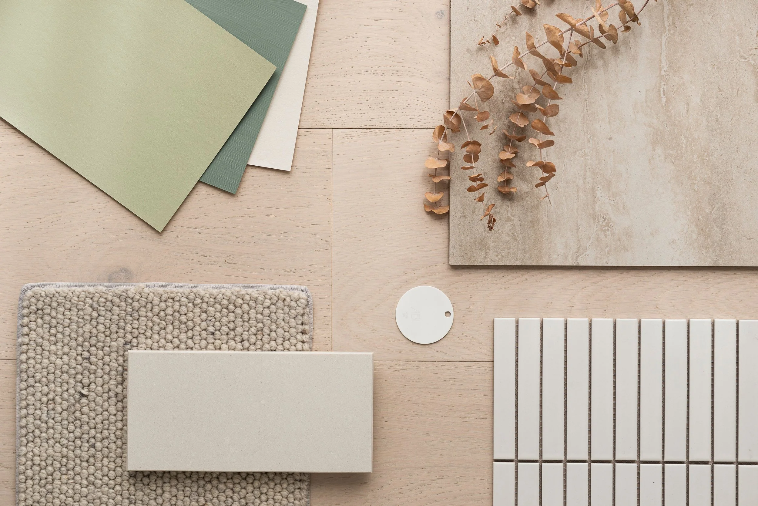
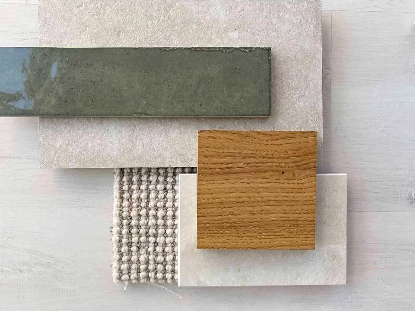
You can use colour to affect how big a space feels! How cool is that? Paler colours recede more and darker colours advance more. So while in some cases white may be the right choice for a small space, if it’s a small and dark room, something like sage green is a great choice to add warmth and brighten it up.
Get emotional with colour
People have different associations with colour because they’ve had different experiences with colour. One person may adore pale pink because it reminds them of candy floss at the fair when they were little. Another may be drawn to green because they grew up surrounded by hills and pastures. While you may need gentle persuading to be braver with colour, base your palette on a colour you already love because it will make you feel good every day.
Use different strengths
I like to use a pale, mid and intense version of the same colour in a space, even if it’s a neutral. Using a half-strength colour in a room that needs lightening, regular-strength in a room that has lovely light already, and double-strength in a room that needs to be cosier creates subtle differences without going crazy with colour.
Three tips for using colour
1. Use a colour wheel
It helps to understand how colours work together, the effect they have on a room and mood, and how to use them to achieve the style you want. One of the principles of interior design is harmony, and colour plays a big part in this. If you walk into a room and the colour scheme is made up of colours that don’t have a relationship to each other, the result will be less harmonious and more chaotic. This is great if you want an enlivening and unique look — there are some incredible designers who mix clashing bright and bold patterns to wow effect. But if you want the room to feel calming, the room reveal is not going to go well for you! To learn about colour, play around with a colour wheel. A colour wheel shows one colour’s relationship to another and helps us observe the effect colours have on one another. You can pick one of these up from your local Resene ColorShop.
2. Use the 60, 30, 10 trick
If you’re struggling to work out how to distribute your colour palette around the house or room, try this trick. Use the hue you want to dominate for 60 per cent of the room; the secondary colour for 30 per cent of the room, to provide visual interest; and the final colour for 10 per cent, to sprinkle on some wow factor. So say your colour palette is white, blue and brass. That could translate to 60 per cent white (all of the walls plus a chair and duvet cover), 30 per cent blue (headboard, cushions, quilt, artwork, accessories), and 10 per cent brass (furniture legs, light fittings, candlesticks). This way the colours are applied in a nice rhythm around the room.
3. Use nature as inspiration
Mother nature is the ultimate colour expert so start to notice the colour values of the outside world in your everyday life — consider it free colour training! Think of the four seasons as examples — mustards, terracotta and the earthy tones of autumn make a warm and restful theme. Soft pinks, saffron yellow and warm white is uplifting and inspired by spring. Blue, white and sandy tones is a summer classic and why ‘coastal’ is a popular interior style.
How to choose and test paints
1. Start by selecting a few versions you like of the same colour. Pick up A2 cards, test pots and test-pot paintbrushes from your local paint shop.
2. Paint each colour on a different card, leaving a white border to create visual separation from any other colours when you hold it up to the wall.
3. Place the cards in different rooms at different times of the day and night to see how the colour varies.
4. Notice how the colours look with the scheme you’ve chosen and any existing elements you are keeping — are the undertones off?
5. Understand sheen levels. Matt creates a flat finish, semi-gloss a satin finish, and high-gloss a lacquered effect.
Areas that are fingerprint-prone like doors and window frames should be painted in an easy-to-clean finish like semi-gloss.


